So, I'm still trying desperately to get hired by John Kricfalusi for his new project starring George Liquor.
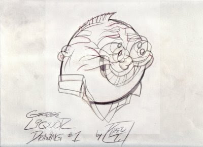
But, he's said that the only position he can hire for that doesn't require you have some experience ( which I don't ) is inking.
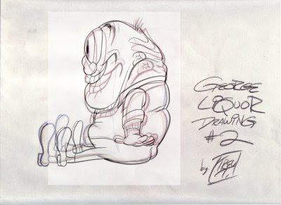
So below are my inking attempts, done with PMOP ink pens.
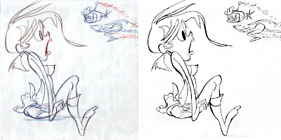
The left side is John's original sketch, and the right is my ink.
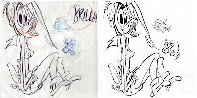
I'm clearly not very good at this, so any and all advice is welcomed.
Thanks!
BY THE WAY, IF ANYONE KNOWS WHERE I CAN FIND A FREE COPY OF ILLUSTRATOR FOR MY MAC G-5, PLEASE LET ME KNOW IN THE COMMENTS, AND I WOULD GREATLY APPRECIATE IT!!
- trevor.


13 comments:
Hey dude, what I'd try, and I'm never really any good at giving advice but...
Enlarge the picture up to an A4 size, this will reduce all that fine detail.
The act of inking is to 'clean up', so let the pen do the talking.
FORGET the drawing (It's your interpretation), concentrate on using the tip of the pen at the start, ad a little more pressure as you move along, and then ease- of to the tip again at the end.
Don't be concerned that some lines are thicker than the others, though you should try to keep the lines thinner on the smaller detail, agian I let the brush/pen talk.
Might be worth practicing this on a scrap bit of paper, just some up vertical and horizontal lines,
straight and curved.
Do lots of them to loosten up.
It's easier to say than do, it's a matter of getting a steady smooth consistant hand. I was signwriter for some years and pretty much all I did was paint.
Practice turning your wrist when doing a curve and easing off.
Remember the wrist.
A brush also gives you nice thicknesses of stoke.
Maybe get yourself a #1 long haired brush, or any small brush will do (long haired hold more ink/paint), but are a little more unstable to control at first.
Are you using a lightbox?
Well do. Use the A4 Sody and paint away.
Don't worry if the paint doesn't cover in one hit. secret, darken in photoshop or the likes later.
Tip:Ink is a bit quicker to use than paint and you don't have to thin it.
Hope this has been of some help?!
If you can't ink in Illustrator I recommend the old fashioned way:
Windsor Newton Series 7 Sable brush. Start with a size 3 or 4. Those 1's are only good for really small details. You should be able to get from tiny to fat with a 3 or 4. For ink, I'm not even sure what's good any more. I used to use Higgins Black Magic and Windsor Newton India Ink.
Practice getting control over line consistency before attempting to ink a drawing. Learn how much ink you need to load up the brush with to have maximum control.
I cannot agree with Hryma's 'forget the drawing' comment. If anything I'm hyper aware of the drawing! The job of an inker is to solidify forms and define shapes. Try not to water down the drawing... especially with Johns work because there are a lot of quirks that he puts into the drawing intentionally. Most of us have been trained to make cartoons more bland, so try to ignore that part of your brain that's telling you to make things perfect or symmetrical.
Keep inking! After a month or two I became very proficient with a brush after relentless practicing.
Oh crap, sorry Brian, never meant to offend I never quite explain myself properly.
Really I was trying to say that if you concentrate on the drawing you are copying whilst inking, you tend to slow down to much and make rough lines (well I do anyway). I like to examin the drawing closely first picking out the thick and thiness of the strokes yada yada.
Then I try to ink it the same without looking at the drawing "to much" else you become to concerned and 'panic' or some shit I don't know I can't explain.
If I do it wrong I'll try again, just means more practice for me.
I probably still haven't explained myself right. Practice till pleasant?
I still use a #1 "long haired", they put a lot down, holding more paint, meaning less returns to your paint pot, no broken lines and you can finish that 'line' in one stroke. I've pinstriped with them and use to do honor- boards ect. But short haired go a four easier to control when starting. I'll shut up now.
It's cool Hryma! I wasn't offended at all, I was just posting my perspective. Brush size is pretty much a personal preference. I've always preferred the longer haired brushes. Pinstriping well takes a lot of skill, so my hat is off to you on that one!
Well guys, looks like I'm buying sable brushes and india ink this weekend.
Thanks for the valuable advice! Come back in a few weeks to see if I've progressed.
- trevor.
PS: Anyone know where I can procure a free copy of Illustrator for my Mac G-5?
Awesome dude, you're gonna have fun! Looks like I'll be doing the same since my monitor just died. (this aint my computer I'm typing this on).
Thanks Brian you're a champ!
Illustrator, we'll I'm finished giving advice, ha,
just kidding, sorry dude I have no idea? Can you get an older version somewhere?
Hey thanks for the nice comment, Trevor. We had a lot of art up on the walls of our house too - and lots of bic pens of course.
Looks like you're workin' hard on George - keep it up!
Btw, that Muto piece you posted previously is INCREDIBLE. My jaw hit the floor watching that moving masterpiece.
What is the "George Liquor project", anyway?
Anon: if I told you, I'd have to kilt you.
And I've got kilts of all sizes, next to me bagpipe and recipe for haggis, so don't you tempt me.
- trevor.
Drawing George Liquor
I don't think these inks are bad at all. I think if you get the lines more steady and less shaky they will look better.
If you want to try out illustrator you can go to macromedia.com and try out the trial for 30 days.
Nice Borat imitation!
Is the George Liquor project a cartoon? Hey, you can trust me! Go ahead, tell me if it's a cartoon in a comment in here. I won't tell anyone!
-that guy who asked you the first time (I know you won't kilt me! You ain't got the guts!)
Anon:
Click the "Drawing George Liquor" link above to find more.
Chenqui.
- trevor.
Post a Comment